

90% of snap judgments about products are based on color alone.
Not your logo design. Not your tagline. Not your product features. Color.
The colors in your brand aren’t decoration; they’re strategic tools that trigger emotions, influence buying decisions, and determine whether customers remember you or scroll past.
The science is clear:
- People decide about products in 90 seconds
- 62-90% of that assessment is based on color (University of Loyola, Maryland)
- Color increases brand recognition by 80% (Reboot)
- 85% of consumers cite color as the primary purchase reason (Kissmetrics)
But here’s what most businesses miss: color meaning changes by culture.
Green isn’t just “eco-friendly” in GCC markets; it carries religious significance and national identity. Gold doesn’t just signal luxury; it speaks to regional taste and historical prestige. Black might mean sophistication in Dubai but mourning in conservative contexts.
For businesses operating in Egypt, Saudi Arabia, and the UAE, understanding regional color psychology isn’t optional; it’s the difference between resonating and offending, between standing out and blending in.
At PGX Agency, we build color psychology branding systems where every hue does measurable work: improving recognition, building trust, creating competitive separation, and driving conversions.
This guide covers:
- The neuroscience behind why color influences decisions before conscious thought
- What each color communicates (with industry-specific applications)
- How to choose brand colors strategically (not based on personal preference)
- Regional color psychology for Egypt, Saudi Arabia, and UAE markets
- Common mistakes that damage brand equity permanently
The Power of Color in Marketing: How It Shapes Customer Emotions
How Your Brain Processes Color (Faster Than You Think)
Color theory in marketing operates on two levels simultaneously:
Conscious processing (slow):
You see blue → You think “professional” → You remember banks use blue. → You conclude “trustworthy.”
Subconscious processing (fast):
You see red → Heart rate increases → You feel urgency → You take action (all before conscious thought)
The speed difference matters:
Your brain processes images 60,000 times faster than text. Within images, color gets processed first, before shape, before text, and before conscious evaluation.
Visual processing timeline:
- 0-100 milliseconds: Color registers, emotional response triggered
- 100-400 milliseconds: Shape and pattern recognition
- 400+ milliseconds: Conscious thought and analysis
This means your brand color creates an impression before customers read your name.
The Neuroscience: Why Color Triggers Emotion
How it works:
- Eyes detect wavelengths (light at different frequencies = different colors)
- Retinal cells send signals to the brain (cones detect color, rods detect light/dark)
- The visual cortex processes color information
- The limbic system activates (the emotional center responds before rational processing)
- The prefrontal cortex rationalizes the emotional response after the fact
Key insight: Emotional response (step 4) happens before rational evaluation (step 5). This is why color emotion marketing works; it influences decisions at the subconscious level.
Physiological responses are measurable:
- Red: Increases heart rate 5-8%, elevates blood pressure slightly (arousal state)
- Blue: Decreases heart rate 3-5%, lowers blood pressure (calming effect)
- Yellow: Increases serotonin production (mood elevation)
- Green: Reduces stress hormones, promotes relaxation (evolutionary water/nature association)
These aren’t marketing theories; they’re biological reactions you can measure in laboratory conditions.
Regional Color Psychology: Why Culture Changes Everything
Same color, different meanings:
| Color | Western Markets | GCC Markets | Why It Differs |
| Green | Environment, sustainability, health | Islam, prosperity, national identity, paradise | Religious significance (Prophet’s cloak color), flag colors (Saudi, UAE, Egypt) |
| Gold | Luxury, wealth | Heritage, prestige, celebration | Historical use in Islamic art and architecture, and wedding/Eid traditions |
| White | Purity, simplicity | Purity, mourning (sometimes), respect | Ihram (Hajj garments), formal dress, but mourning in some contexts |
| Black | Sophistication, luxury | Formality, mourning, modesty | Abaya, cultural dress, mourning periods, and formal occasions |
| Red | Passion, energy, danger | Energy, celebration, caution | Henna, celebrations, but aggression in some contexts |
| Blue | Trust, calm, corporate | Trust, protection, tradition | Historically rare/expensive dye = prestige; evil eye protection |
Critical for brands: If you’re operating across Egypt, KSA, and UAE, your color palette for brands must work in all three markets, or you need market-specific variations.
Read More: Top Brands with the Best Marketing Strategies in 2025

What Each Color Says About Your Brand Identity
Every color is a shortcut to perception. Here’s what each communicates and when to use it.
Red: Energy, Urgency, Appetite
Psychological effects:
- Increases heart rate 5-8% (physiological arousal)
- Creates a sense of urgency (time scarcity perception)
- Stimulates appetite (blood = meat, ripe fruit = food)
- Demands immediate attention (danger response)
Best for:
- Food & beverage (McDonald’s, Coca-Cola, KFC, appetite stimulation)
- Sales & clearances (urgency, scarcity, “act now”)
- Entertainment & sports (energy, excitement, boldness)
- CTA buttons (conversion boost: red outperforms blue by 21% in A/B tests)
Avoid:
- Healthcare (triggers anxiety about blood, danger)
- Finance (suggests risk, volatility, loss)
- Luxury (too aggressive, lacks sophistication)
- Conservative B2B (too bold, unprofessional)
Why it works: Red is processed faster than any other color (shortest wavelength = quickest brain response). It literally makes things look closer and larger (perceptual effect).
GCC consideration: Red works for energy and celebration (henna, festivities), but avoid overuse in conservative contexts where it can signal aggression.
Examples:
- Coca-Cola: Red = energy, excitement, refreshment (consistent since 1886; now owns the color in the beverage category)
- YouTube: Red = urgency, “watch now,” entertainment
- Netflix: Red = entertainment, excitement, “binge-worthy”
Blue: Trust, Stability, Professionalism
Psychological effects:
- Decreases heart rate 3-5% (calming physiological response)
- Lowers blood pressure (relaxation state)
- Increases productivity (focus without agitation)
- Signals’ reliability (sky and water are constant and predictable)
Best for:
- Finance & banking (trust is everything: PayPal, Chase, American Express)
- Healthcare (calm, professional, safe: many hospitals and insurance)
- Technology (innovation + reliability: IBM, Intel, HP, Facebook, LinkedIn)
- B2B services (professional, established, competent)
Avoid:
- Food (suppresses appetite, no natural blue foods)
- Luxury (too common, lacks exclusivity)
- When all competitors use it (differentiation needed)
Why it works: Blue is a universally preferred color (42% of people globally rank it #1). It creates psychological safety, critical when customers are trusting you with money, health, or data.
GCC consideration: Blue works well across all three markets. Historically expensive dye (lapis lazuli) = prestige. Also, evil eye protection symbolism.
The downside: Blue is the most overused color in branding. 33% of the top 100 brands use blue as their primary color. If all your competitors use blue, you blend in rather than stand out.
Examples:
- PayPal: Blue = “Your money is safe with us.”
- Facebook: Blue = “Your data is secure” (ironic, but intended message)
- Ford: Blue = “Reliable, established, American strength”
Yellow: Optimism, Attention, Accessibility
Psychological effects:
- Increases serotonin (mood elevation)
- Grabs peripheral vision attention (highest visibility)
- Stimulates mental activity (alertness)
- Signals approachability (non-threatening warmth)
Best for:
- Budget/value brands (accessible, welcoming: IKEA, Best Buy)
- Children’s products (playful, energetic, fun)
- Creative services (optimism, ideas, innovation)
- Attention elements (warnings, highlights, emphasis)
Avoid:
- Luxury (too casual, lacks prestige)
- Large backgrounds (eye strain, overwhelming)
- When legibility matters (yellow on white = invisible)
Why it works: Yellow reflects more light than any other color = highest visibility. Your eyes detect it in peripheral vision better than any other color. That’s why hazard signs, taxis, and school buses use it.
GCC consideration: Yellow works for energy and optimism, but avoid during mourning periods or overly bright shades that signal cheapness.
Examples:
- McDonald’s golden arches: Yellow + red = appetite + accessibility (“Everyone’s welcome, come eat.”)
- IKEA: Yellow + blue = approachable + trustworthy (“Affordable furniture you can trust”)
- Snapchat: Yellow = youthful, fun, casual communication
Green: Growth, Health, Balance
Psychological effects:
- Reduces stress hormones (evolutionary water/vegetation association)
- Promotes relaxation (nature connection)
- Signals freshness and health (vegetation = food)
- Creates balance perception (midpoint between warm/cool colors)
Best for:
- Health & wellness (natural, organic, vitality: Whole Foods, Tropicana)
- Financial growth (prosperity, wealth accumulation: TD Bank, Fidelity)
- Environmental brands (sustainability, eco-friendly)
- Regional GCC brands (cultural/religious resonance)
Avoid:
- Food sometimes (unnatural green = spoiled, wrong)
- Luxury (too common, lacks exclusivity unless deep jewel tones)
Why it works: Green requires no eye adjustment (midpoint wavelength). Your eyes relax when processing green, literally less strain than other colors.
GCC consideration: Green is THE most culturally powerful color in GCC markets.
Why green dominates in MENA:
- Religious: Color of Prophet Muhammad’s cloak, Islamic significance
- National: Saudi, UAE, Algeria, Libya flags feature green prominently
- Cultural: Paradise (Jannah) is described with greenery in the Quran
- Symbolic: Prosperity, fertility, life in desert climates
If your brand serves GCC markets, green creates instant cultural resonance, but use it respectfully, not exploitatively.
Examples:
- Starbucks: Green = natural, fresh, ethically sourced
- Whole Foods: Green = organic, health, environmentalism
- Careem (Middle East): Green = regional identity, trust, growth
Black: Luxury, Sophistication, Authority
Psychological effects:
- Creates perception of weight and power (the heaviest color psychologically)
- Signals exclusivity (absence of color = restraint, control)
- Increases perceived value (premium products use black packaging)
- Commands respect and authority (formal, serious)
Best for:
- Luxury brands (Chanel, Prada, Dior, sophistication without shouting)
- Premium tech (Apple, Sony, minimalist elegance)
- Fashion (versatile, slimming, timeless)
- Professional services (law, consulting, serious expertise)
Avoid:
- Children’s products (too serious, not playful)
- Healthcare (too heavy, can feel depressing)
- Budget brands (signals premium = wrong price expectation)
- Some conservative GCC contexts (mourning associations)
Why it works: Black creates maximum contrast (visibility) while feeling restrained (sophistication). It makes other colors, especially gold and white, appear more luxurious by contrast.
GCC consideration:
UAE/Dubai: Black = luxury, sophistication (international cosmopolitan taste)
Saudi Arabia: Black = modesty, formality, but mourning in some contexts
Egypt: Black = elegance in fashion, but heavy for some applications
For luxury brands in GCC: Black + gold combination particularly powerful (black sophistication + gold regional prestige).
Examples:
- Chanel: Black = timeless elegance, “expensive simplicity”
- Apple: Black/space gray = premium technology, minimalist design
- Nike: Black = performance, serious athletics, no-nonsense
Purple: Creativity, Luxury, Wisdom
Psychological effects:
- Stimulates imagination (rare in nature = unusual = creative)
- Signals royalty and prestige (historically expensive dye)
- Creates mystery and intrigue (uncommon = special)
- Balances warm/cool (combines red energy and blue calm)
Best for:
- Beauty & cosmetics (luxury, transformation: Urban Decay, Milka)
- Creative services (imagination, originality)
- Spiritual/wisdom brands (meditation, education, insight)
- Premium products with personality (not stiff luxury, approachable premium)
Avoid:
- Food (unnatural purple = distrust)
- Conservative B2B (too unconventional)
- When your category uses it heavily (Hallmark, Cadbury, Yahoo), differentiation is lost.
Why it works: Purple is the least common in nature and was historically the most expensive dye to produce (Tyrian purple from sea snails was worth more than gold). That historical scarcity created a “special” association that persists today.
GCC consideration: Purple works for creativity and premium positioning. Less culturally loaded than other colors, offering an opportunity for differentiation.
Examples:
- Cadbury: Purple = premium chocolate, indulgence, special treat
- Hallmark: Purple = meaningful, emotional, special occasions
- Twitch: Purple = creative, unique, digital culture
Orange: Confidence, Energy, Friendliness
Psychological effects:
- Combines red’s energy (60%) and yellow’s friendliness (40%)
- Creates urgency without aggression (action-oriented but not threatening)
- Stimulates enthusiasm and confidence (energetic optimism)
- Feels accessible and approachable (warm but not intimidating)
Best for:
- E-commerce CTAs (Amazon “Add to Cart,” urgent but friendly)
- Tech startups (innovation, energy, approachability)
- Entertainment & sports (fun, active, engaging)
- Youth brands (energetic, bold, confident)
Avoid:
- Luxury (too casual, lacks sophistication)
- Conservative B2B (too bold, unprofessional)
- Healthcare (can feel jarring in serious contexts)
Why it works: Orange is dramatically underused compared to red and blue (differentiation opportunity). It creates urgency (conversion) without anxiety (trust preservation).
A/B test data: Orange CTA buttons outperform red by 32% and green by 28% in e-commerce contexts (a combination of urgency and friendliness = lower purchase anxiety).
GCC consideration: Orange works well for energy and modernity. No negative cultural associations. Good differentiation opportunity.
Examples:
- Amazon: Orange arrow = “everything from A to Z” + CTA buttons (urgent but friendly)
- Fanta: Orange = fun, youth, refreshment
- Harley-Davidson: Orange = bold, adventurous, confident
Read More: Brand Development: How PGX Agency Build Strong Brands
Using Color Psychology to Strengthen Brand Recognition
Recognition isn’t awareness. Awareness means people have heard of you. Recognition means they identify you instantly without reading your name.
Why Consistency Creates Recognition
The neuroscience: Your brain creates neural pathways through repetition. When you see the same color repeatedly in the same context, your brain builds associative memory: this color = this brand.
How long does it take?
- 5-7 exposures: Brain begins pattern recognition
- 10-15 exposures: Association strengthens
- 20+ exposures: Automatic recognition (subconscious)
After sufficient exposure, your brain processes brand color → brand identity in <100 milliseconds (before conscious thought).
Examples of color ownership:
- Coca-Cola red: 94% global recognition without logo or text
- UPS brown: Trademarked “Pullman Brown,” owns the color in shipping
- Cadbury purple: Pantone 2685C, legally protected in the UK
These companies don’t just use colors; they OWN colors in their categories through decades of consistent use.
The ROI of Color Consistency
Consistent brand presentation increases revenue by 23% (Lucidpress, 2019)
Why:
- Faster recognition = less mental effort = more purchases
- Stronger memory = top-of-mind when a purchase need arises
- Trust building = consistency signals reliability
- Marketing efficiency = every dollar compounds previous investment
Example: If you change your brand colors every 2-3 years, you’re starting recognition from zero each time. If you maintain colors for 10+ years, recognition compounds continuously.
Multi-Platform Color Systems
Your color palette for brands must work across every touchpoint:
Digital:
- Website (various screen sizes, resolutions)
- Social media (small thumbnails, different platform dimensions)
- Email (various email clients, dark mode compatibility)
- Mobile apps (iOS, Android, different screen brightness)
Print:
- Business cards, brochures, packaging
- Outdoor advertising (different lighting conditions)
- Merchandise (fabrics and materials affect color appearance)
Video:
- Motion graphics, video ads
- Screen brightness variations
- Compression effects on color
Physical:
- Retail environments (different lighting)
- Product packaging (various materials)
- Signage (distance visibility, weather resistance)
Colors look different in each context. Professional color systems specify exact values for each use case:
- HEX (digital): #0000FF
- RGB (screens): rgb(0, 0, 255)
- CMYK (print): cmyk(100, 100, 0, 0)
- Pantone (brand consistency): Pantone 2738 C
Color Accessibility: Don’t Exclude Customers
8% of men and 0.5% of women have color blindness (most common: red-green deficiency).
WCAG (Web Content Accessibility Guidelines) standards:
- Minimum contrast ratio: 4.5:1 for normal text
- Large text: 3:1 for 18 pt+ or 14 pt+ bold
- Essential elements: 3:1 minimum (buttons, icons, links)
Why this matters financially: If 8% of men can’t read your CTA button because of poor contrast, you’re losing 8% of potential male customers.
Test your colors: Use WebAIM Contrast Checker or similar tools to validate all text/background combinations.
Color-blind-friendly palettes:
- Avoid red/green as the only differentiator (use shape, pattern, text labels too)
- Use blue/orange combinations (distinguishable across all color blindness types)
- Test with color blindness simulators before finalizing
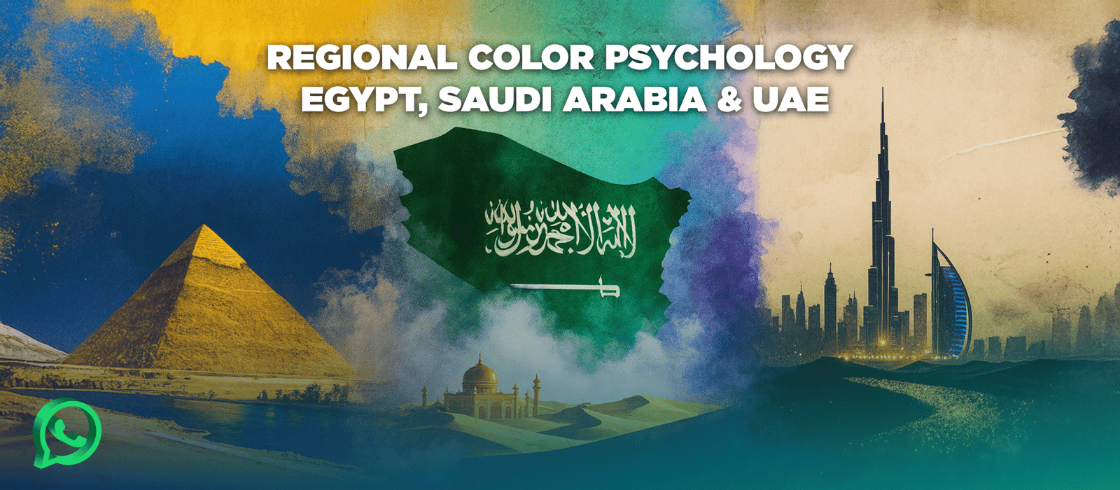
Regional Color Psychology: Egypt, Saudi Arabia & UAE
Same colors, different meanings. Here’s what you must know for GCC markets.
Egypt: Heritage Meets Aspiration
Most powerful colors:
Gold (Pharaonic heritage):
- Historical significance: Ancient Egyptian art, jewelry, and tombs
- Modern application: Luxury brands, celebrations, premium positioning
- Psychology: Heritage pride + luxury aspiration
- Use for: Premium products, cultural brands, wedding/celebration marketing
Blue (Nile, Mediterranean):
- Cultural significance: Lifeblood of Egypt, historical trade
- Modern application: Trust, stability, technology
- Psychology: Life-giving, essential, reliable
- Use for: Finance, healthcare, government, tech
Sandy earth tones (desert, ancient architecture):
- Cultural significance: Pyramids, desert landscape, Coptic/Islamic architecture
- Modern application: Natural, authentic, rooted
- Psychology: Connection to land and history
- Use for: Tourism, crafts, traditional products
Socioeconomic color patterns:
- Lower-income areas: Bright, saturated colors (visibility, optimism)
- Middle class: Moderate tones, trending colors (aspiration, modernity)
- Affluent areas: Muted, sophisticated palettes (refinement, restraint)
Seasonal considerations:
- Ramadan: Gold, green, deep purples (spirituality, celebration)
- Coptic celebrations: Red, white (significant for the Christian minority)
- National holidays: Red, white, black (flag colors, national pride)
Saudi Arabia: Tradition Embracing Innovation
Most powerful colors:
Green (Religious, national identity):
- Islamic significance: Prophet Muhammad’s cloak, paradise descriptions in the Quran
- National symbol: Flag color, national identity
- Vision 2030: Growth, prosperity, environmental sustainability
- Use carefully: Respectful integration, not exploitation of religious meaning
- Best for: Financial growth, health/wellness, national brands, environmental initiatives
White (Purity, formality):
- Religious significance: Ihram (Hajj pilgrimage garments), emphasis
- Cultural significance: Traditional dress, formal occasions
- Modern application: Clean, pure, premium minimalism
- Use for: Healthcare, luxury minimalism, formal services
Gold (Prestige, celebration):
- Cultural significance: Wedding traditions, Eid celebrations, luxury gift-giving
- Modern application: Premium positioning, special occasions
- Psychology: Success, achievement, generosity
- Use for: Luxury brands, celebration marketing, premium services
Deep blue, purple (Innovation, sophistication):
- Vision 2030 context: Technology, entertainment, modernization
- Modern application: Tech startups, creative industries, youth brands
- Psychology: Progressive while maintaining sophistication
- Use for: Fintech, entertainment, modern retail
Gender considerations:
Products for women:
- Softer hues are acceptable (pastels, rose gold, elegant tones)
- Avoid overly bold/aggressive colors in conservative contexts
- Luxury colors: Black, gold, white, deep jewel tones
Products for men:
- Bold, strong colors (deep blues, greens, blacks)
- Avoid pastels or colors perceived as feminine
- Professional colors: Navy, charcoal, forest green
Religious sensitivity:
- During Ramadan: Green, gold, deep purples (spiritual, celebratory, respectful)
- During Hajj: White (purity), gold (significance), muted tones
- Avoid: Overly bright/flashy during mourning periods or serious religious occasions
UAE: Cosmopolitan Luxury
Most powerful colors:
Black + Gold (Luxury standard):
- Why it dominates: International luxury language + regional prestige
- Application: Fashion, hospitality, real estate, premium services
- Psychology: Sophistication + achievement
- Examples: Burj Khalifa marketing, luxury hotels, high-end retail
Blues, silvers, and whites (Modern, clean, futuristic):
- Dubai positioning: “City of the future,” innovation, technology
- Application: Tech, finance, modern architecture, smart city initiatives
- Psychology: Progressive, clean, efficient
- Examples: Dubai government branding, tech startups, modern developments
Deep jewel tones (Ruby, emerald, and sapphire):
- Application: Luxury retail, jewelry, high-end fashion
- Psychology: Rich, precious, exclusive
- Cultural fit: Resonates with both local and international affluent
Market segmentation:
Emirati nationals:
- Respect for traditional colors (green, gold, black)
- Luxury signals important (quality over trendy)
- Family values (sophisticated, modest, heritage-respecting)
Expatriate majority:
- International cosmopolitan tastes
- Diverse cultural backgrounds (no single preference dominates)
- Luxury aspiration (status-conscious, brand-aware)
Youth market (both Emirati and expat):
- Increasingly bold, international trends
- Social media influence (Instagram aesthetics matter)
- Sustainability consciousness growing (natural tones, eco colors)
Geographic nuances:
Dubai: Bold, modern, international (anything goes if executed well)
Abu Dhabi: More conservative, traditional, formal (respect tradition more)
Sharjah: Most conservative, cultural heritage emphasized (modest colors safer)
Seasonal patterns:
- Ramadan: Green, gold, deep purples (spiritual elegance)
- Eid: Bright, celebratory colors (joy, festivity, family)
- Summer (June-August): Many residents travel abroad (adjust campaign timing, not just colors)
- Dubai Shopping Festival: Bold, energetic colors (retail excitement, deals)
Comparison Table: Color Psychology Across GCC Markets
| Color | Egypt | Saudi Arabia | UAE |
| Green | Positive, Islamic identity | MOST powerful (religious/national) | Positive growth, but less dominant |
| Gold | Heritage, luxury, celebration | Prestige, weddings, and generosity | Luxury standard (with black) |
| Black | Elegant in fashion, heavy elsewhere | Modesty (abaya), formality, mourning | Luxury, sophistication (primary) |
| Blue | Trust, Nile association, safe choice | Innovation (Vision 2030), trust | Modern, futuristic, clean |
| White | Purity, simplicity, sometimes mourning | Purity, Ihram, formal, premium | Minimalism, luxury, modern |
| Red | Energy, celebration, and henna traditions | Caution (can signal aggression) | Energy, but use sparingly |
| Purple | Creativity, premium (neutral culturally) | Modern, creative, less traditional | Luxury with personality |
| Orange | Energy, modernity, youth | Modern, energetic (Vision 2030 vibe) | Bold, contemporary, energetic |
Best Practices for Choosing Brand Colors
Choosing colors strategically requires a process, not preference.
Step 1: Start With Audience Psychology (Not Your Preference)
Your favorite color is irrelevant. What matters: What does your target customer associate with quality, trust, or desire in your industry?
Framework:
Question 1: Who is your target customer?
- Demographics: Age, income, location, education
- Psychographics: Values, aspirations, fears, preferences
- Industry: B2B vs. B2C, sector-specific expectations
Question 2: What do they need to feel about your brand?
- Trust and safety → Blue, green
- Energy and urgency → Red, orange
- Luxury and exclusivity → Black, gold, purple
- Accessibility and friendliness → Yellow, orange
- Innovation and creativity → Purple, teal, unique combinations
Question 3: What colors do they already associate with success in your category?
- Research top brands in your industry
- Identify color patterns (what dominates?)
- Understand why those colors work (psychological fit or just convention?)
Step 2: Competitive Color Analysis
Map your top 8-10 competitors’ color choices:
| Competitor | Primary Color | Secondary | Positioning |
| Competitor A | Blue | White | Traditional, trustworthy |
| Competitor B | Blue | Gray | Professional, corporate |
| Competitor C | Green | Blue | Modern, growth-focused |
| Competitor D | Red | Yellow | Energetic, accessible |
Strategic decisions:
If everyone uses similar colors:
Option A: Use expected color to signal category membership
- Pro: Customers immediately understand what you do
- Con: You blend in; differentiation is minimal
- When to choose: Established categories where trust matters more than differentiation (finance, healthcare)
Option B: Choose a contrasting color to stand out
- Pro: Instant visual differentiation, memorable
- Con: Risk of confusing category expectations, may signal wrong benefits
- When to choose: Crowded categories where attention matters, or when repositioning a category
Example: T-Mobile chose magenta in the telecom industry, dominated by blue/red. Result: Instant differentiation, 95% brand recognition based on color alone.
If color usage is mixed: Bigger opportunity for ownable differentiation.
Step 3: Build a Scalable Color System
Your brand needs a structured palette:
Primary color (60% usage):
- Your main brand identifier
- Logo, primary headlines, key elements
- Should be ownable and memorable
- Choose: One strong, distinct color
Secondary color (30% usage):
- Supports primary, adds variety
- Backgrounds, secondary elements, accents
- Choose: 1-2 colors that complement the primary
Accent colors (10% usage):
- CTAs, highlights, special emphasis
- Creates hierarchy and guides action
- Choose: 1-2 high-contrast colors for buttons/links
Neutrals (flexible usage):
- Text, backgrounds, spacing
- Black, white, grays
- Choose: 2-3 shades (light gray, medium gray, dark gray/black)
Example system:
Primary: Deep blue (#003D82) – trust, professionalism
Secondary: Light gray (#F5F5F5) – clean backgrounds
Accent: Orange (#FF6B35) – CTA buttons, action elements
Neutrals: White (#FFFFFF), dark gray (#333333) – text and spacing
This ratio (60/30/10) prevents visual chaos while maintaining flexibility.
Step 4: Test Across All Contexts
Colors look different in different environments:
Digital variations:
- Phone screens (smaller, brighter, color shifts)
- Desktop monitors (larger, color accuracy varies)
- Dark mode (colors need to work on black backgrounds)
- Different browsers (slight rendering differences)
Print variations:
- Paper quality (glossy vs. matte) affects appearance.
- Lighting conditions (indoor, outdoor, direct sun)
- Print technology (offset, digital, screen printing differences)
Physical variations:
- Product materials (fabric, plastic, and metal) all show color differently.
- Environmental lighting (store lighting, home lighting, daylight)
- Distance (colors that work close-up might disappear from far away)
Testing checklist:
- Create logo mockups in all sizes (favicon, social media thumbnail, billboard)
- Test website on mobile and desktop (both light and dark mode)
- Print samples on different paper types
- View colors in different lighting (office fluorescent, home LED, natural daylight)
- Test with color blindness simulators
- Show to 10-15 target audience members for feedback
Don’t commit to colors until you’ve tested them in real-world conditions where customers will actually see them.
Step 5: Document Everything
Create brand guidelines specifying:
Color specifications:
- HEX codes (digital): #003D82
- RGB values (screens): rgb(0, 61, 130)
- CMYK values (print): cmyk(100, 53, 0, 49)
- Pantone codes (brand consistency): Pantone 295 C
Usage rules:
- Where each color appears (primary for logo, secondary for backgrounds, etc.)
- Minimum sizes for colored logos (don’t use a full-color logo below 1 inch width)
- Approved color combinations (which colors can be used together)
- Prohibited uses (never use primary color on secondary color background)
Accessibility standards:
- Contrast ratios for all text/background combinations
- Alternative color options for accessibility needs
Examples and templates:
- Business card mockups
- Social media templates
- Presentation templates
- Email signature formats
Why documentation matters: Without clear guidelines, colors drift over time. Different team members make different choices. External partners guess at color values. Consistency disappears, and recognition suffers.
Common Color Psychology Mistakes to Avoid
Mistake 1: Following Personal Preference
Why it’s tempting: “I love purple, so my brand should be purple.”
Why it fails: Your taste is irrelevant. What matters is what your target audience associates with quality, trust, or aspiration in your industry.
Example: The Founder loves orange and builds a healthcare brand with orange as the primary color.
Problem: Orange creates anxiety in healthcare contexts (signals urgency, emergency). Patients subconsciously feel less calm. Brand struggles to build trust despite excellent service.
What to do instead:
- Research your industry color norms (what do trusted brands in your category use?)
- Survey target customers (what colors make them feel [desired emotion]?)
- Test color options with the audience before committing
If you truly want a color for personal reasons, use it as an accent (10%), not a primary (60%).
Mistake 2: Copying Competitors Exactly
Why it’s tempting: “They’re successful, so their colors must work.”
Why it fails: Creates zero differentiation. You become forgettable, just another blue tech company or red food brand.
Example: A New fintech startup chooses blue because “all banks use blue.”
Problem: Blends into a sea of blue finance brands, has no visual distinction, and relies entirely on product differentiation (harder to communicate).
What to do instead:
- Understand WHY competitors chose their colors (what psychological benefit does blue provide in finance? Trust.)
- Identify the underlying need (customers need to trust you)
- Find alternative ways to communicate the same benefit (deep green can also signal trust + growth, purple can signal trust + innovation)
Differentiate while still addressing category expectations.
Mistake 3: Using Too Many Colors
Why it’s tempting: “More colors = more versatile brand, more options for creativity.”
Why it fails:
- Creates visual chaos (the eye doesn’t know where to focus)
- Weakens recognition (no single color = no color ownership)
- Inconsistent application (different people choose different colors from the palette)
Example: A Brand creates a palette with 7 colors. The marketing team uses 3 colors in social posts, the design team uses 3 different ones for the website, and the sales team picks 2 different ones for presentations.
Result: The Brand looks different everywhere; customers don’t recognize consistency.
What to do instead:
- Stick to 2-4 brand colors + neutrals
- Use 60/30/10 rule (primary 60%, secondary 30%, accent 10%)
- Create a clear hierarchy (this color for this purpose, that color for that purpose)
More colors ≠ , better branding. Restraint = recognition.
Mistake 4: Ignoring Cultural Context
Why it’s tempting: “Color meaning is universal; design is design.”
Why it fails: The Same color means dramatically different things in different cultures. What works in New York might offend in Riyadh.
Example: A Western beauty brand enters the Saudi market using the same pink/white palette that was successful in the US/Europe.
Problem: Overly feminine pastel pink reads as childish and insubstantial in the conservative Saudi market, where luxury beauty should signal sophistication and quality. Sales underperform despite a strong product.
What to do instead:
- Research regional color psychology before entering new markets
- Consult local cultural experts (don’t rely on Google alone)
- Test with the local audience before the full market launch
- Create regional variations if necessary (global brand identity + local color adaptation)
Cultural fluency isn’t optional for regional success; it’s the difference between resonating and alienating.
Mistake 5: Poor Contrast and Accessibility
Why it’s tempting: “Subtle is sophisticated; high contrast is harsh.”
Why it fails:
- People literally can’t read your content (text disappears into the background)
- Excludes colorblind users (8% of men can’t distinguish certain colors)
- Reduces conversions (illegible CTA = zero clicks)
Example: A Luxury brand uses light gray text (#CCCCCC) on a white background (#FFFFFF) for “sophisticated minimalism.”
Problem: Contrast ratio 1.4:1 (WCAG requires a minimum of 4.5:1). Text is barely visible, especially on mobile in sunlight. Website bounce rate is 78% because users can’t read the content.
What to do instead:
- Test all text/background combinations with contrast checker tools
- Meet WCAG standards: 4.5:1 minimum for normal text, 3:1 for large text
- Use color blindness simulators to ensure critical elements remain distinguishable
- Don’t rely on color alone for important distinctions (use icons, labels, patterns too)
Accessibility isn’t just ethics; it’s business sense. If people can’t read your CTA, they can’t convert.
Mistake 6: No Documentation or Guidelines
Why it’s tempting: “Everyone on the team knows what our colors look like.”
Why it fails:
- Colors drift over time (people estimate and get it slightly wrong repeatedly)
- New team members’ guess (no reference = inconsistency)
- External partners improvise (agencies, printers, vendors use different values)
- Multi-platform inconsistency (HEX ≠ RGB ≠ CMYK without proper conversion)
Example: The Brand launches with specific blue (#0066CC). Over 2 years, without guidelines: the website uses #0066CC, social graphics use #0066FF (too bright), print materials use a CMYK conversion that looks purple-ish, and the new designer uses #0055CC.
Result: The Brand looks different everywhere; recognition weakens.
What to do instead:
- Create comprehensive brand guidelines (PDF or online style guide)
- Specify exact color values for every use case (HEX, RGB, CMYK, Pantone)
- Include visual examples (correct and incorrect usage)
- Distribute to everyone who touches brand assets (internal team + external partners)
- Enforce guidelines (review all materials before publication)
Undocumented colors = inconsistent brand = weakened recognition = lost revenue.
How to Test and Validate Your Color Choices
Don’t guess. Test.
A/B Testing Framework
What to test:
Logo variations:
- Same logo design, 2-3 different color options
- Show to the target audience and measure recognition speed, emotional response, brand attribute associations (trust, innovation, quality)
CTA button colors:
- Same page, different button colors (red vs. orange vs. green)
- Measure: Click-through rate, conversion rate, time to decision
Brand palette combinations:
- Same content, different color schemes
- Measure: Time on page, engagement, recall after 24 hours
Cultural variations:
- Same brand, colors adapted for different markets (Egypt vs. KSA vs. UAE)
- Measure: Brand consideration, purchase intent, cultural appropriateness perception
How to test:
Quantitative (data-driven):
Online A/B tests:
- Use Google Optimize, Optimizely, or VWO
- Split traffic 50/50 between color variations
- Run until statistical significance (minimum 100 conversions per variation)
- Measure: Conversion rate, click-through rate, bounce rate
Eye-tracking studies:
- Measure where people look first (does color draw attention to important elements?)
- Measure dwell time (how long eyes focus on colored elements)
Recognition speed tests:
- Show logo for 0.5 seconds, remove it, and ask for identification
- Faster recognition = stronger color choice
- Test with 50+ target audience members
Qualitative (perception-driven):
Audience surveys:
- Show color options, and ask, “Which brand feels more [trustworthy/innovative/luxurious]?”
- Ask, “What industry do you think this brand is in?”
- Ask: “Would you consider buying from this brand?”
- Survey 100+ target audience members for reliable data
Focus groups:
- 6-10 target audience members
- Show color variations, discuss reactions
- Explore WHY certain colors resonate or don’t
Cultural validation:
- Test with regional audiences (separate Egyptian, Saudi, Emirati groups)
- Ask about cultural appropriateness, emotional response, and associations
- Identify any negative connotations you missed
When results contradict expectations:
Scenario: You chose blue for trust, but testing shows the target audience associates your specific blue with sadness or coldness.
Options:
- Adjust shade: Test warmer blue vs. cooler blue
- Change combination: Maybe blue works better with a warmer secondary color
- Accept data: Sometimes your assumption was wrong; choose a color that actually works
Trust testing data over intuition. Your personal reaction doesn’t matter. Target audience reaction is everything.
How PGX Agency Helps You Build Strategically Impactful Brand Colors
We don’t do “pretty colors.” We build color psychology branding systems that function as strategic business tools.
Our Process
Phase 1: Strategic Foundation
Research:
- Competitive color analysis (what do the top 10 competitors use and why?)
- Industry benchmarking (color usage patterns in your sector)
- Target audience psychology (what colors does your audience associate with quality/trust/aspiration?)
- Regional cultural analysis (Egypt, KSA, UAE, specific color meanings)
Positioning:
- Define brand personality (sophisticated, energetic, trustworthy, innovative?)
- Identify desired emotional response (what should customers feel?)
- Determine strategic positioning (category membership vs. differentiation)
Deliverable: Color strategy document with psychological rationale
Phase 2: Color Development
Palette creation:
- Develop 2-3 color system options
- Each system: Primary + secondary + accent + neutrals
- Psychological rationale for each choice
- Industry fit analysis
Multi-context testing:
- Digital mockups (website, social media, mobile app)
- Print mockups (business cards, brochures, packaging)
- Physical environment mockups (signage, retail, office)
- Accessibility validation (contrast ratios, color blindness simulation)
Regional adaptation:
- Cultural appropriateness check for Egypt, KSA, UAE
- Religious sensitivity validation
- Socioeconomic segment fit
Deliverable: 2-3 complete color systems with applications across contexts
Phase 3: Validation
Audience testing:
- Survey 100+ target audience members
- Measure: Recognition, emotional response, brand attribute associations
- Cultural validation with regional sub-groups
A/B testing (if digital presence exists):
- Test color variations on website/social media
- Measure: Conversion rate, engagement, bounce rate
Refinement:
- Adjust based on data
- Optimize for performance and preference
- Finalize the single-color system
Deliverable: Validated color system with testing data
Phase 4: Documentation
Comprehensive brand guidelines:
Color specifications:
- Exact values (HEX, RGB, CMYK, Pantone) for every color
- Primary, secondary, accent, neutral definitions
- Color relationships and hierarchy
Usage rules:
- Where each color appears
- Approved combinations
- Minimum sizes for colored elements
- What NOT to do (prohibited uses)
Applications:
- Logo variations in all color combinations
- Business card templates
- Social media templates (Instagram, LinkedIn, Facebook)
- Presentation templates
- Email signature formats
- Print material examples
Accessibility standards:
- Contrast ratios for all text/background combinations
- Alternative options for accessibility needs
Deliverable: Complete brand guidelines (50-80 page PDF + digital style guide)
Phase 5: Integration (Ongoing)
Apply the color system across:
- Logo design and brand identity
- Website development (if needed)
- Social media management (consistent visual identity)
- Marketing materials (print, digital, video)
- Physical environments (retail, office, signage)
Monitoring:
- Quarterly brand audits (is color being used consistently?)
- Performance tracking (Does the color system improve recognition/conversion?)
- Evolution planning (when/how to refresh without losing recognition)
Why Egypt and GCC Markets Need a Specialized Color Strategy
We work with brands operating across Egypt, Saudi Arabia, and the UAE, understanding:
Cultural color meanings:
- How green works differently in GCC vs. Western markets (religious vs. environmental)
- When gold feels premium vs. excessive
- Why black reads differently in Dubai (luxury) vs. conservative Saudi contexts (modesty/mourning)
Regional luxury signals:
- What colors communicate prestige in Cairo vs. Riyadh, vs. Dubai
- How international luxury brands adapt to regional markets
- Balance between global brand identity and local cultural resonance
Religious and seasonal sensitivity:
- Appropriate color use during Ramadan, Eid, and Hajj seasons
- Mourning period considerations
- National holidays and celebrations
Socioeconomic segmentation:
- Color preferences by income level and education
- Urban vs. rural aesthetic differences
- Generational shifts (youth vs. traditional preferences)
Global trends meet regional taste; we bridge both.
Integration With Complete Brand Systems
Color doesn’t exist in isolation. At PGX, we integrate color with:
Typography:
- Certain colors pair better with certain font styles (sans-serif vs. serif)
- Color affects readability (light colors need heavier fonts).
- Cultural typography (Arabic font selection complements color psychology)
Logo design:
- Shape and color create combined meaning (geometric + blue = tech trust, organic + green = natural health)
- Scalability (colors must work at all sizes)
- Versatility (logo needs to work in color and monochrome)
Photography style:
- Color grading must match brand palette (warm filters vs. cool filters)
- Consistent visual treatment across all imagery
- Cultural representation (who appears in photos, how they’re styled)
Messaging:
- Visual tone must match verbal tone (energetic colors + energetic copy, sophisticated colors + refined copy)
- Consistency across touchpoints (same feeling everywhere)
Complete brand systems: Strategy + Visual Identity + Messaging + Digital + Print + Experiential
Technology and Tools
Color management:
- Professional color calibration (monitors, printers)
- Color profile management (ensure consistency across devices)
- Pantone Matching System (brand color precision)
Testing infrastructure:
- A/B testing platforms (Google Optimize, Optimizely)
- Heatmapping and eye-tracking (Hotjar, Crazy Egg)
- Survey tools (SurveyMonkey, Typeform, Qualtrics)
Design systems:
- Figma/Sketch design libraries (consistent color application)
- Style guide platforms (online brand guideline portals)
- Asset management (Digital Asset Management systems for approved colors/files)
Start Building Your Strategic Color System
Color isn’t decoration; it’s a competitive advantage.
The right colors build instant recognition, create emotional connection, and drive measurable conversion improvements. The wrong colors cost you trust, confuse your audience, and waste marketing investment.
At PGX Agency, we’ve built color systems for 100+ brands across Egypt, Saudi Arabia, and the UAE, combining color psychology science with regional cultural intelligence.
FAQs
What color is best for a logo?
No universal “best color”; it depends on your industry and audience. Blue dominates finance/healthcare (trust). Red works for food/entertainment (appetite, urgency). Green suits health/finance growth/GCC brands (nature, Islamic identity). Black signals luxury. The right color matches customer expectations for your category while creating differentiation. Test with the target audience; don’t choose based on personal preference.
How many colors should my brand use?
2-4 colors plus neutrals. One primary (main identifier), 1-2 secondary (support), 1-2 accent (CTAs), plus black/white/gray (text/backgrounds). Use a 60/30/10 ratio (primary 60%, secondary 30%, accent 10%). More than 5 colors create chaos. Fewer than 2 limits flexibility.
Do colors actually affect sales?
Yes, measurably. Color increases brand recognition by 80% (Reboot). 85% of consumers cite color as the primary purchase reason (Kissmetrics). CTA buttons in contrasting colors improve conversion by 20-30%. Consistent color use increases revenue by 23% (Lucidpress). Color doesn’t sell bad products, but it influences perception, triggers emotion, and guides behavior, directly impacting revenue.
What colors work best for Egyptian and GCC audiences?
Egypt: Gold (heritage, luxury), blue (trust), and earth tones.
Saudi Arabia: Green (Islamic/national, most powerful), gold (prestige), white (purity), and blue/purple (innovation).
UAE: Black and gold (luxury), blue/silver (modern), and jewel tones (richness).
Avoid: Heavy black in conservative Saudi contexts (mourning) and overly bright colors for luxury. Always research specific segments; preferences vary by age, income, and location.
How does color psychology differ for B2B vs. B2C?
B2B: Needs professional colors (blue, gray, and deep green) because buyers justify choices to stakeholders. Avoid bright/playful colors (they seem unprofessional). Decisions take months and must signal “safe choice.” B2C: Broader range of works, can be bold/emotional. Decisions are faster (seconds to days), driven by personal preference. Both need strategic industry fit, but B2B prioritizes credibility, and B2C prioritizes emotional connection.


